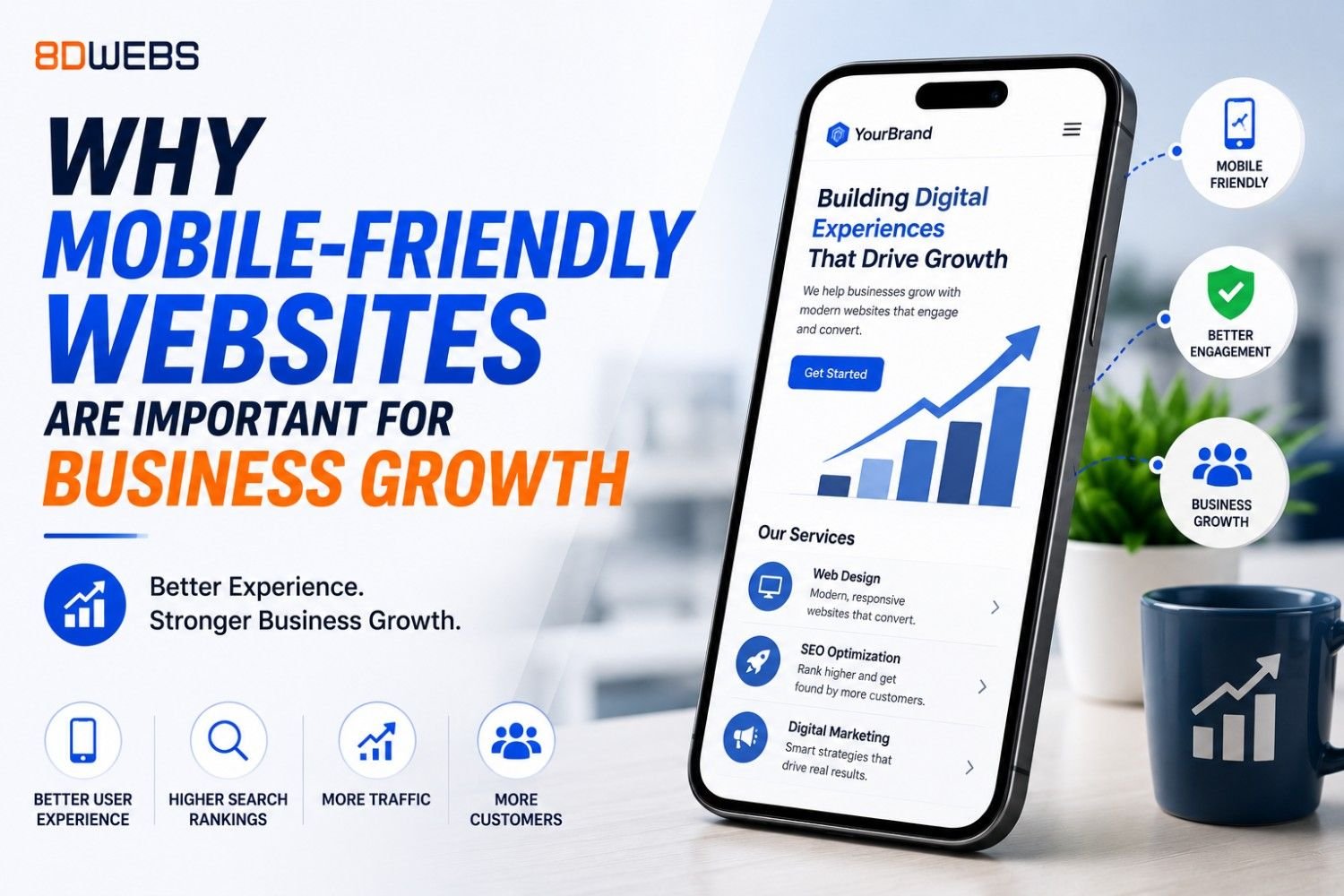
Mobile usage dominates search and social referrals in most industries. Google indexes mobile-first, meaning the phone experience primarily determines how your site is evaluated. A desktop-only mindset in 2026 directly caps visibility and conversions.
Mobile-friendly is more than a narrow column. It is thumb-friendly navigation, readable type without zooming, forms that use appropriate keyboards, autofill support, and checkout flows that minimize typing. Each friction point costs completions.
Speed on cellular networks is part of mobile friendliness. Heavy hero videos and unoptimized sliders hurt more on the go than in office Wi-Fi tests. Design for progressive enhancement: core content and CTAs work even when extras load later.
Local and voice-oriented searches often happen on phones. Click-to-call, maps, and hours must be obvious. If customers cannot act in two taps, competitors with cleaner mobile UX capture the intent you paid to create.
Testing should include real devices, not only browser emulators. iOS Safari and Android Chrome behave differently with sticky headers, video autoplay, and font rendering. QA across a small device matrix prevents surprises after launch.
Mobile apps are not a substitute for a strong mobile web presence unless your product truly needs installed features. For many businesses, a fast responsive site plus optional app later is the capital-efficient path.
Analytics segmented by device reveal hidden problems: high mobile bounce on pricing pages, drop-off on long forms, or slow product galleries. Fix those before scaling ad spend.
8D Webs builds mobile-first interfaces with performance budgets and accessible patterns. We validate on real hardware so your growth plans are not undermined by a site that only shines on a developer laptop.