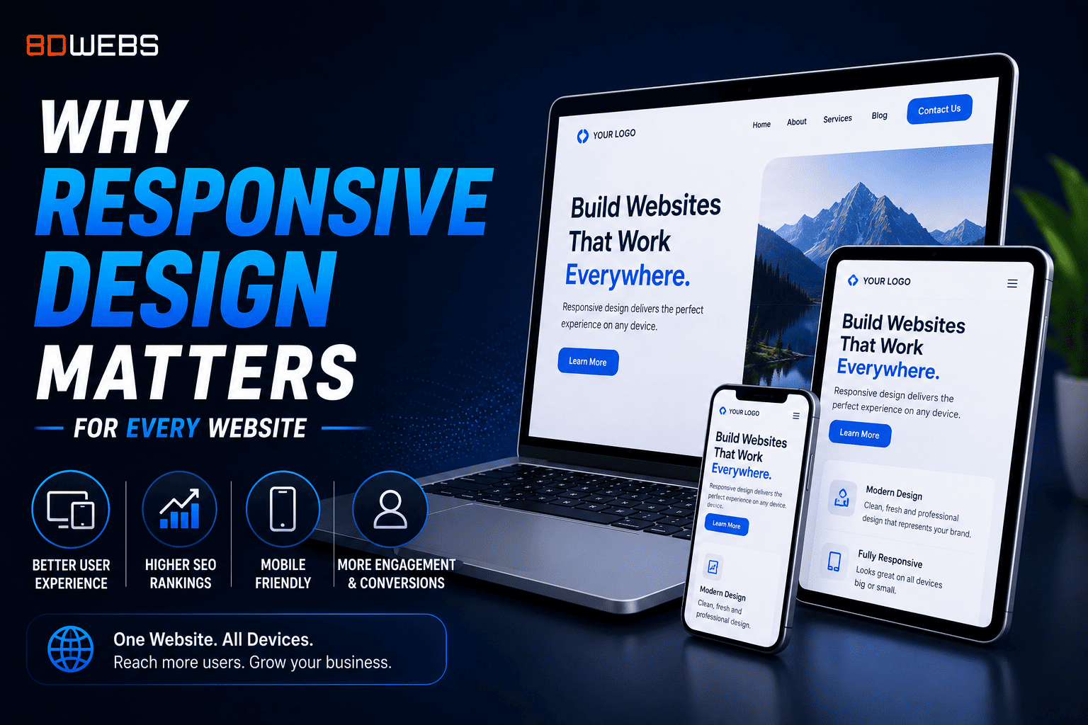
Responsive design uses flexible grids, fluid images, and breakpoints so content reflows instead of forcing horizontal scroll or tiny text. One codebase serves phones, tablets, laptops, and large monitors.
Separate mobile-only sites or apps duplicating marketing content split SEO authority and double maintenance. Responsive plus performance optimization is usually the sustainable default.
Breakpoints should follow content, not device catalogues alone. Test where paragraphs become unwieldy and where navigation should collapse into accessible menus.
Touch targets need adequate size and spacing. Hover-only interactions fail on touch devices—menus, tooltips, and galleries need alternatives.
Responsive images with srcset save bandwidth on small screens while preserving quality on retina displays. Art direction sometimes crops differently per breakpoint for focus.
Forms and tables are frequent failure points. Stack fields vertically, use responsive table patterns or cards, and avoid PDF-only downloads on mobile.
Regression testing after redesigns should include rotation, split-screen, and font scaling accessibility settings.
8D Webs implements responsive systems within design systems so new pages inherit correct patterns automatically—reducing drift as your marketing team publishes.